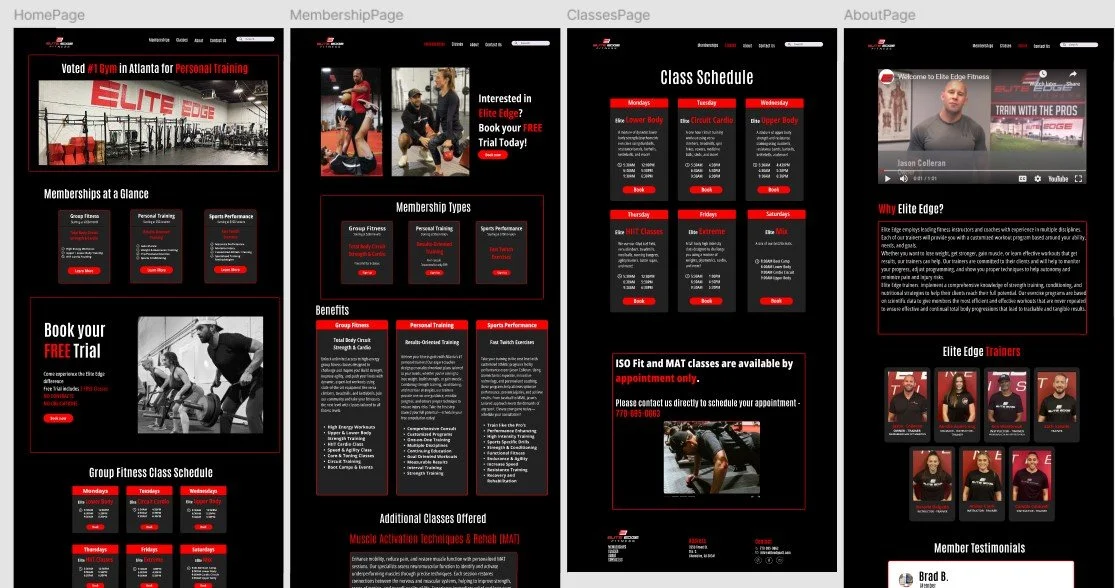
Elite Edge UX Audit
Elite Edge is a local gym and fitness studio with a loyal member base — but their website presented usability challenges that made it difficult for new visitors to navigate, sign up, or explore their services. I conducted a full UX audit focused on heuristics and accessibility, using both Nielsen’s heuristics and WCAG 2.1 guidelines to uncover areas for improvement.
The Problem:
While Elite Edge offers a strong in-person experience, its website lacked the same clarity and ease of use. Navigation was inconsistent, important information was buried or missing entirely, and there were multiple accessibility concerns — especially for screen reader users. These issues created friction for both new and returning users looking for quick answers, pricing, or service info.
Audit Approach:
I approached this project with two key frameworks:
Nielsen’s 10 Usability Heuristics — to evaluate site structure, consistency, error prevention, and visibility of system status
WCAG 2.1 Accessibility Guidelines — to assess color contrast, keyboard navigation, and screen reader compatibility
I also observed 5 users interact with the site and took notes on moments of confusion, drop-off, and hesitation.
Key Findings:
Missing “About” and “First-Time Guest” pages disrupted onboarding for new users
Inconsistent navigation and lack of clear CTAs made it hard to complete tasks
Insufficient color contrast and missing alt text presented accessibility barriers
Service rates and class descriptions were hard to find, leading to user drop-off
Recommendations:
Add a dedicated “First Time at Elite?” page for new visitors
Improve navigation structure and simplify menu labels
Increase color contrast and include alt text for all images
Reorganize homepage content to make rates and services easily scannable
Add a search bar and footer quick links for faster access to key info
Tools Used:
Manual accessibility review, WCAG checklist, heuristic evaluation sheet, Figma (for proposed redesign sketches), PowerPoint (for final presentation)
What I learned:
This project deepened my awareness of how accessibility and clarity are essential — not optional — parts of good design. It also sharpened my ability to observe user behavior and translate those findings into simple, actionable improvements. I learned how to balance industry standards with real user expectations, and how to clearly communicate opportunities for a better digital experience.
Want more details?
Tap the Visuals
Redesigned Site Prototype ⤴
Usability Recommendations ⤴
Personas ⤴
User Research ⤴
Heuristic Evaluation ⤴


